Orkestra
Brand Identity
Orkestra is a London-based recruitment company. They primarily work within the tech industry and combine lots of individuals with areas of expertise (as an orchestra), rather than lots of people who are jacks of all trades.
ROLE
BRAND DESIGNER
Orkestra is a brand new London-based recruitment company. They primarily work within the tech industry and combine lots of individuals with areas of expertise to help companies build tech teams.
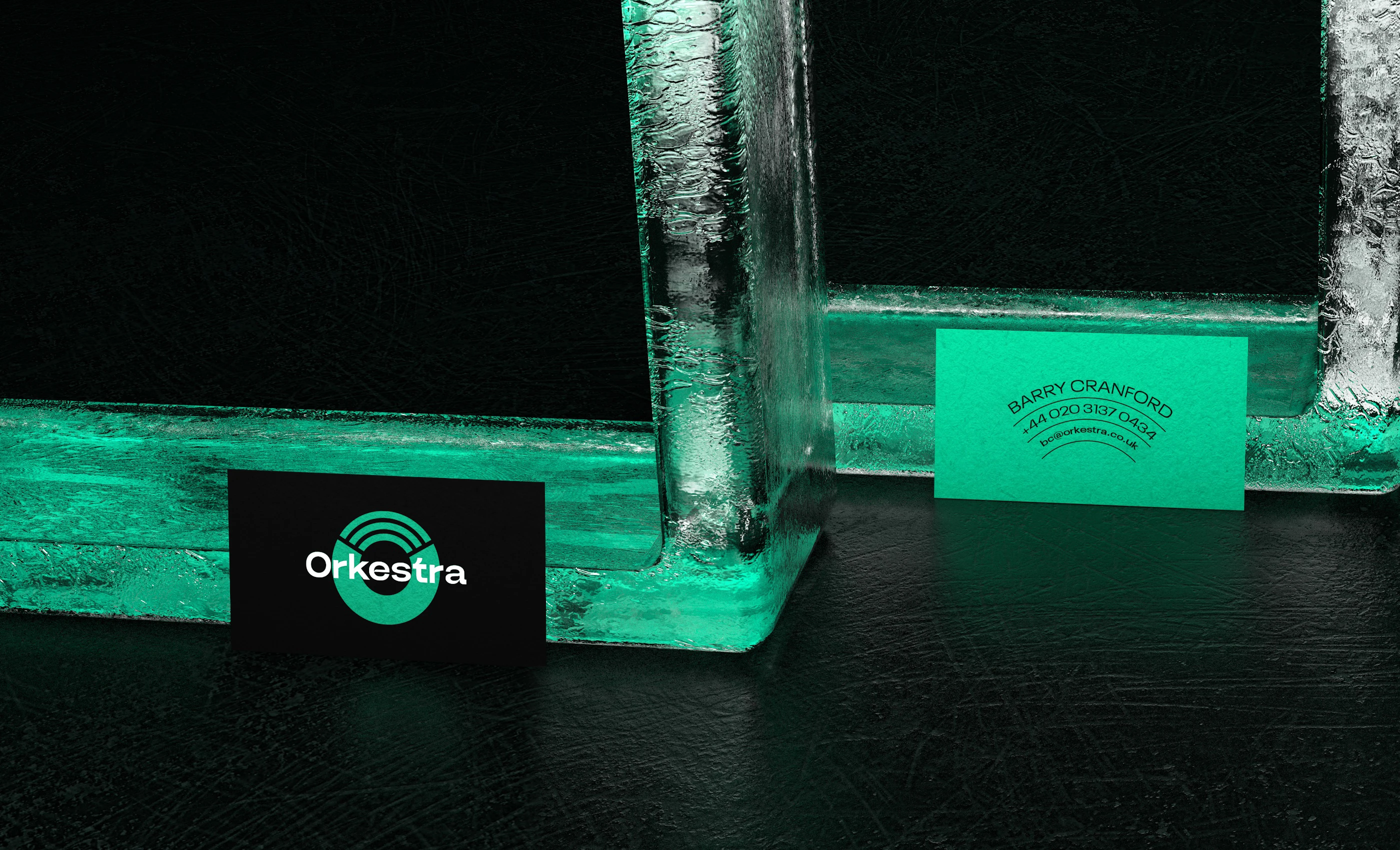
Their new logo is a perfectly rounded circle that consists of two parts. The lower part is solid, indicating
the stable team of a company, organization, or even a startup. The top 3 lines symbolize the integration
of specialists with specific skills in different fields that are needed for the company into the team.
We chose a specific tone of green color because it perfectly combines in itself important characteristics
of the brand mentioned above.

Just like an orchestra, they recruit a strong team of specialists in different fields rather than a single person with multiple skills, so those three lines are in the shape of the top view of an orchestra.